The Logout Button Vanished—And Tech Companies Are Betting You Won't Notice
Netflix, Instagram, and Amazon have made signing out deliberately difficult. Here's why platforms hide the exit, and what builders can do to respect user autonomy instead.
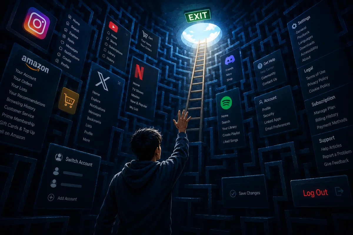
Attempt to sign out of Netflix through your television interface. Chances are you'll find yourself repeatedly pressing the left arrow, accidentally triggering a profile menu, navigating through unhelpful support sections, and eventually discovering the logout function buried beneath layers of navigation that rival a classic video game cheat code sequence.
Netflix isn't alone in this practice. Instagram tucks the logout option at the bottom of an endless settings menu. Amazon treats account access as a permanent arrangement. The logout button—once a straightforward, visible element positioned alongside your username as a courteous exit—has been deliberately obscured, downplayed, and concealed.
This represents more than poor interface design. It's a deliberate corporate strategy.
The Era of Permanent Inhabitation
During the internet's early years, logging out was routine practice. Users would access a digital service, complete their task, click logout, and close the connection. The boundary between physical and digital spaces remained distinct and uncomplicated.
Contemporary product teams regard user logout not as a legitimate choice, but as a serious metrics problem. They classify it as a "churn event." Within strategy meetings, when someone explicitly logs out, the engagement spell breaks. Logout means you might reconsider whether you actually want to spend another 45 minutes scrolling. It creates a moment of uncomfortable self-awareness—that instant when you see your reflection in a darkened screen and question your digital habits.
To prevent this uncomfortable reckoning, technology companies engineered deliberate friction.
By making logout sufficiently inconvenient, users select the easier option: remaining perpetually logged in, continuously tracked, and constantly exposed to notifications. The shift moved from tool usage to permanent residence within digital environments designed for indefinite occupancy.
"Frictionless" UX is a One-Way Street
Designers and developers frequently emphasize friction reduction. They optimize purchase flows, streamline authentication, and celebrate "one-click" functionality. Yet friction mysteriously disappears only when it serves the platform's financial interests.
- Signing in? Magic links! Facial recognition! Single-tap Google authentication! Completely seamless!
- Signing out? Confirmation required. Password re-entry. Email verification codes. Complex navigation sequences. Captcha challenges. Please reconsider leaving us.
This imbalance reveals the contradiction in contemporary user experience philosophy. When an interface enables effortless entry but demands significant effort to exit, it abandons user-centered principles—it becomes a trap.
Traditional software-as-a-service dashboards and social platforms once featured straightforward profile menus: Profile | Settings | Log Out.
Today's versions look dramatically different: Profile | Settings | Subscription | Billing | Dark Mode | Help | Legal | Terms of Service | … [Keep Scrolling] … | Switch Accounts | Log Out. Platforms deliberately extend menus to exhaust users before they locate the exit.
The Design Rebellion: What We Can Do as Creators
Builders have an alternative. Participation in user-retention schemes isn't mandatory. Respectful interfaces honor human autonomy. Several approaches can establish a more ethical digital environment:
1. Rehabilitate the Profile Dropdown
Avoid treating profile menus as storage for compliance documentation and promotional features. Maintain logout accessibility. When users select their avatar, logout should appear immediately without requiring additional scrolling.
2. Design Explicit "Session Closures"
Rather than automatically advancing to the next piece of content when a task concludes, create interfaces that acknowledge completion. Upon finishing a lesson, generating a report, or concluding a significant workflow, provide a straightforward, visually appealing option to conclude and depart.
3. Embrace "Smart" Expirations
Restore user control over session duration. Consider settings like: "Automatically log me out after 6:00 PM" or "Keep me logged in for this session only." Returning authentication control to users transforms a passive dependency into an intentional utility.
The User's Counter-Attack: How to Force the Exit
When platforms refuse to provide accessible logout options, users can establish their own escape routes. Those frustrated by permanent app residency can reclaim control:
- The Nuclear Option (Browser Auto-Delete): Configure desktop and mobile browsers to automatically clear cookies and stored data whenever you close the application. Yes, you'll need to log in again next time. That's intentional. It forces you to consciously decide: "Do I genuinely want to open this app right now, or am I just acting from habit?"
- The "Burn After Reading" Extension: Deploy browser extensions that compartmentalize sessions or instantly eliminate cookies for particular websites when you close the tab. If an app requires ten clicks to logout, your browser can accomplish it in milliseconds.
- App Offloading and Timer Locks: On smartphones, leverage operating system capabilities to restrict access. Establish usage limits, or utilize the "Offload App" function on your device for applications you want to stop using regularly. Removing the app icon from your home screen interrupts the pattern of constant availability.
Taking Back the Exit
Concealing the exit erodes confidence. A quality digital product shouldn't resemble a timeshare sales pitch where the representative blocks the door until you commit.
Genuine user autonomy requires respecting departure. Superior product design should handle user exit with equivalent care and simplicity as user entry. Offering someone a transparent, respectful method to say "I'm finished for now" doesn't guarantee they'll abandon the platform—it suggests they'll value your app enough to return voluntarily.
The moment has arrived to restore the visible, unapologetic logout button. We should abandon constructing digital establishments where visitors can depart whenever desired, but never truly leave.
Read more

California Tightens Rules on Robotaxis as Incidents Mount
A new state law sets safety standards and accountability measures for autonomous vehicle operators, requiring local support staff and penalties for blocking emergency responders.

Wawa Elevates Long-Tenured Executive to CIO Role
The convenience store chain has named Bill O'Donnell, a 25-year company veteran, as its new chief information technology officer, putting him in charge of tech strategy, cybersecurity and digital operations.

ServiceNow Debuts Flow, a Conversational Service Desk Built for Speed Over Complexity
ServiceNow is rolling out Flow, a natural language service desk tool that automates employee requests through Slack and Microsoft Teams without requiring a full IT service management overhaul.