The Ampersand at 2,000: Why Designers Still Can't Settle on a Single Look
From Roman graffiti to modern typefaces, the & symbol has survived nearly two millennia—yet type designers continue to reinvent it in wildly different ways.
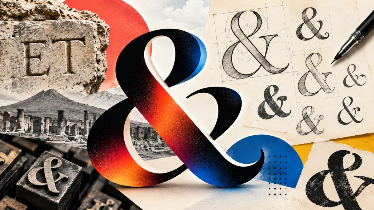
Today marks World Ampersand Day, giving the design community a moment to honor what may be typography's most versatile character. The &, that familiar squiggle on your keyboard, has endured nearly 2,000 years of transformation. Yet despite its longevity, designers across the globe still cannot agree on how it ought to appear.
From Latin Letters to a Ligature
The ampersand began not as a symbol but as a practical solution to writing. It emerged from the Latin word et, which translates to "and." Roman scribes started merging the letters E and T into a single connected form—a ligature. One of the oldest known instances was etched into the walls of Pompeii, preserved when Mount Vesuvius erupted in 79 AD.
Through the centuries, that basic et underwent endless variation. Designers twisted, curled and embellished it until it became the character we know today. The catch: there is no single definitive ampersand. Load a dozen typefaces and you will encounter a dozen distinct interpretations. Some preserve traces of the original E and T. Others morph into shapes resembling an 8, a knot, a treble clef, or the kind of doodle someone sketches while feigning attention in a meeting.
The Accidental Birth of a Word
The name itself has an equally curious origin. The & once held a place in English instruction as the 27th letter of the alphabet, appearing after Z. Teachers faced a problem: saying simply "and" would create confusion in the recitation. So students concluded their alphabet with the phrase "and per se and"—meaning "& by itself means and."
Spoken rapidly, "and per se and" blurs into a single word. That linguistic accident gave us ampersand. A character most people access by pressing Shift + 7 thus carries within its name the echo of schoolchildren, centuries of typographic invention, and Roman graffiti. The holiday itself is far younger: designer and typographer Chaz DeSimone established World Ampersand Day in 2015 as part of his AmperArt initiative.
Two thousand years later, designers continue crafting fresh versions of the symbol. Apparently, the simple word "and" has never quite sufficed.
Read more

California Tightens Rules on Robotaxis as Incidents Mount
A new state law sets safety standards and accountability measures for autonomous vehicle operators, requiring local support staff and penalties for blocking emergency responders.

Wawa Elevates Long-Tenured Executive to CIO Role
The convenience store chain has named Bill O'Donnell, a 25-year company veteran, as its new chief information technology officer, putting him in charge of tech strategy, cybersecurity and digital operations.

ServiceNow Debuts Flow, a Conversational Service Desk Built for Speed Over Complexity
ServiceNow is rolling out Flow, a natural language service desk tool that automates employee requests through Slack and Microsoft Teams without requiring a full IT service management overhaul.