Dark Mode Toggle Fatigue: Why Designers Love a Feature Users Might Ignore
The ubiquitous sun-and-moon icon has become a staple of modern web design, but experts question whether this prominent interface element actually serves user needs or simply reflects designer preferences.
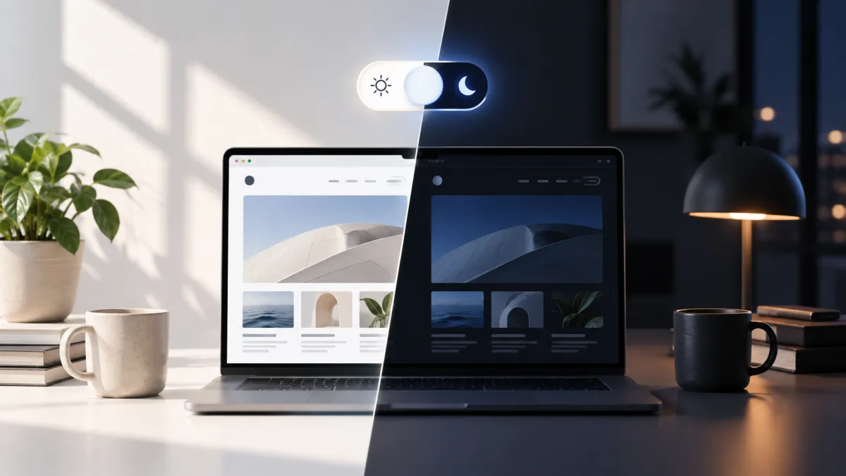
At some point in recent years, the small sun-and-moon toggle transformed into what feels like a non-negotiable design element. Portfolio sites include it. Documentation pages feature it. SaaS platforms display it front and center in their headers, competing for space with features users genuinely came to access. Yet few designers pause to examine a fundamental question: does this button warrant such prominent placement?
Web standards and UX expert Lea Verou contends that the vast majority of websites probably shouldn't maintain a persistent dark mode toggle at all. Her position isn't a rejection of dark mode itself. Rather, she suggests that designers have allocated considerable interface prominence to what amounts to a relatively minor user preference.
Designing for Ourselves, Not Our Users
During her investigation, Verou observed a striking pattern: persistent dark mode toggles appeared predominantly on websites built for developers. While this observation doesn't constitute definitive proof that general users disregard dark mode, it prompts a revealing question: have designers adopted the toggle partly because other designers have already done so?
Modern browsers have possessed the capability to detect whether users prefer light or dark interfaces at the system level for years. Websites could simply honor that preference automatically, reserving a less visible override option for the minority of people who genuinely want to switch modes. In this scenario, dark mode functionality remains available without demanding prime real estate in the interface.
The conversation has evolved into something surprisingly intricate. Verou has advocated for a streamlined two-state model instead of the conventional Light/Dark/System combination. This discussion has spawned implementations ranging from practical to intentionally absurd—including a satirical 100-state dark mode control that illustrates how web design excels at transforming minor inconveniences into elaborate interface solutions.
Perhaps the deeper issue transcends dark mode entirely. Each button added to an interface competes for user attention, and every trendy UI pattern eventually warrants the uncomfortable question that designers typically avoid: Is this element present because users genuinely require it, or simply because competing designers have already implemented it?
Read more
Figma's Agent Takes Over Design System Maintenance Tasks
Figma's new agent can automate repetitive design system work, from documentation to auditing designs for consistency. The tool helps teams keep their libraries organized and product work aligned with system standards.

California Tightens Rules on Robotaxis as Incidents Mount
A new state law sets safety standards and accountability measures for autonomous vehicle operators, requiring local support staff and penalties for blocking emergency responders.

Wawa Elevates Long-Tenured Executive to CIO Role
The convenience store chain has named Bill O'Donnell, a 25-year company veteran, as its new chief information technology officer, putting him in charge of tech strategy, cybersecurity and digital operations.